


Gotto's Mets logo stands the test of time
500 entries, three judges and one winner: Cartoonist Ray Gotto designs the Mets team logo
The New York Mets unveiled their new franchise logo to the public.
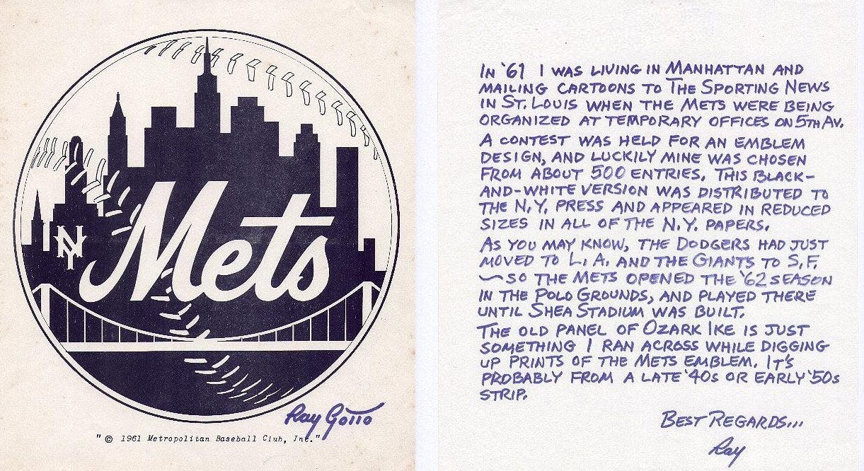
Three judges — Willard Mullins (World-Telegram and The Sun); John Groth (Sports Illustrated); and Burris Jenkins Jr. (The New York Journal-American) — reviewed more than 500 entries before selecting Ray Gotto’s Mets logo design.
The backdrop of Gotto’s logo (seen above with a handwritten note) featured the New York skyline including the Woolworth Tower, the Empire State Building, the United Nations building, Williamsburg Savings Bank, a church and the famed Brooklyn Bridge.
“We now have a good name, a fine insigne, a sound organizations and some players,” said Mets president George Weiss. “Now we have to produce a team.”
The logo, which appeared in all the New York newspapers, described that the logo’s primary colors will be orange and blue to pay homage to its predecessors.
Gotto’s winning design earned him a $1,000 pay day while runners-up — George O. Davies (New York), Ella Johnson (East Northport, Long Island), and E.G. Harridsleff (Jersey City) — all received a pair of season tickets for their efforts.
Gotto, a renowned comic strip designer and creator, created the syndicated comic Ozark Ike and dozens of sports comic designs for The Sporting News.
